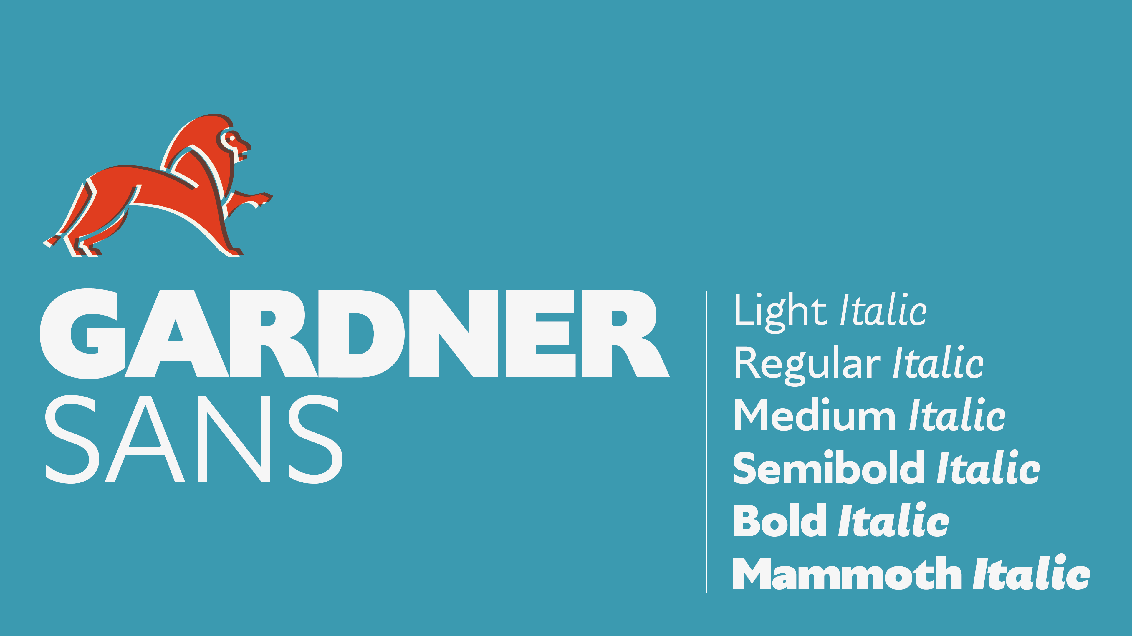
Gardner Sans
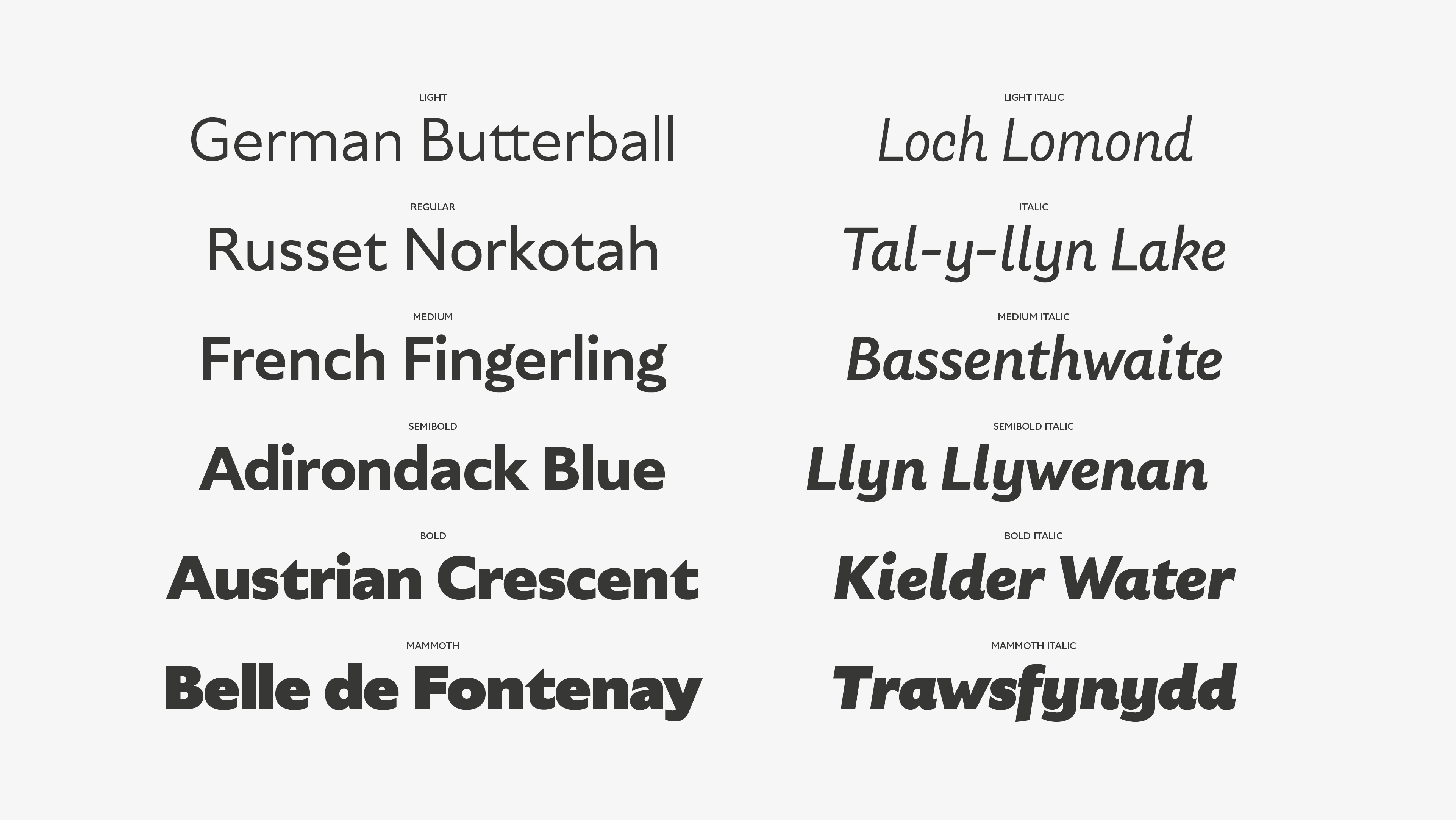
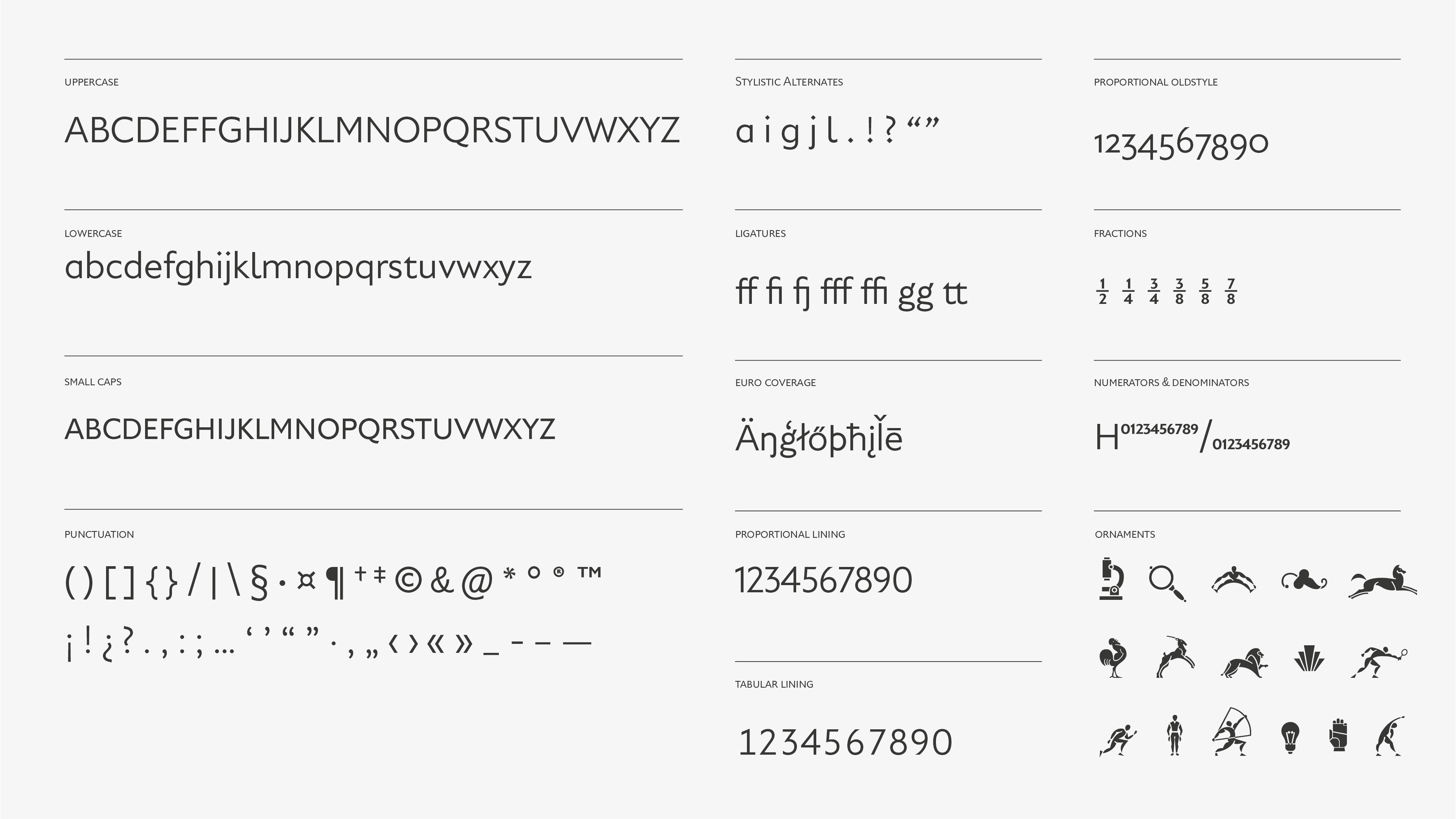
Gardner Sans is a humanist sans serif with a range of weights, italics, small caps stylistics alternates and a set of decorative ornaments. The light and regular faces work at smaller sizes and the heavier weights are good for display lettering.
It is inspired by a few historical sources including Stephenson Blakes' Granby, Gill Sans, as well as some old hand-done lettering for sales tickets. The name (and the basis for the small caps) derives in-particular from the Roy Gardner collection of sales tickets from early 20th century that can be found on spitalfieldslife.com The heavier weights were particularly influenced by a later cut of Gill Sans, Extra Bold 321. The italic is more of a contemporary mix of humanist styles.
It is available to buy on MyFonts and YouWorkForThem.


It is available to buy on MyFonts and YouWorkForThem.